前言
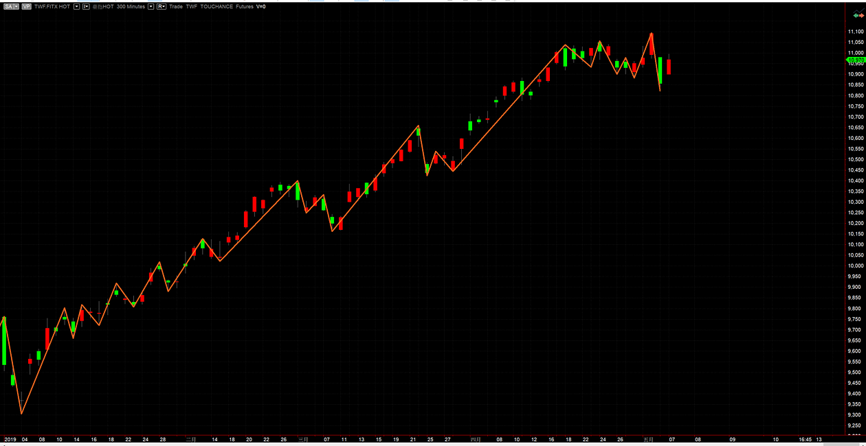
我們可以利用一些簡單的定義,就能畫出市面上常見的折線圖。但將折線圖畫出來了,又該如何實際應用在交易中呢?每波上漲下跌的振幅與持續時間,是不是會有規律的分布呢?因此本文會先利用Multicharts蒐集台指期的日線相關資料,再利用Python進行分析。
資料整理
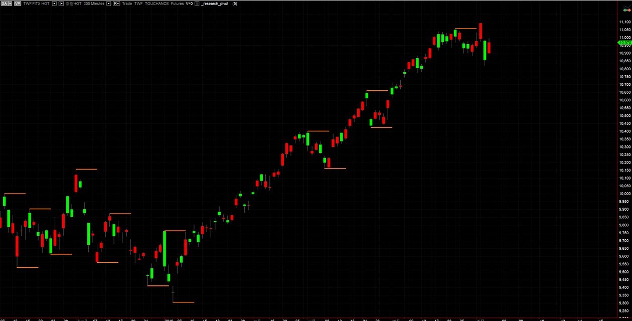
找出所有的轉折點(高點大於左右x日高點,低點低於左右x日低點),定義上漲為1,下跌為-1,盤整為0,並輸出轉折點日期、振幅、時間。將x帶入3、5、10日,即可得到三個周期的資料。
input:
	len(5);
variable:
	count(0);

condition1 = True;
for count = 0 to len*2-1 begin
	if low[len] > low[count] then begin
		condition1 = False;
		break;
	end;
end;

condition2 = True;
for count = 0 to len*2-1 begin
	if high[len] < high[count] then begin
		condition2 = False;
		break;
	end;
end;

if condition1 then TL_New(date[len],time[len],low[len],date,time,low[len]);
if condition2 then TL_New(date[len],time[len],high[len],date,time,high[len]);

variable:
	pre_date(0), pre_price(0), pre_kbar_num(0), pre_type(0),
	now_date(0), now_price(0), now_kbar_num(0), now_type(0);
if condition1 or condition2 then begin
	now_kbar_num = currentbar[len];
	now_date = date[len];
	if condition1 then begin
		now_price = low[len];
		now_type = -1;
	end;
	if condition2 then begin
		now_price = high[len];
		now_type = 1;
	end;
	value1 = 0;
	if now_type = 1 and pre_type = -1 then value1 = 1;
	if now_type = -1 and pre_type = 1 then value1 = -1;
	print(pre_date, ",", now_date, ",", value1, ",", now_kbar_num-pre_kbar_num, ",", (now_price-pre_price));
	pre_kbar_num = now_kbar_num;
	pre_price = now_price;
	pre_type = now_type;
	pre_date = now_date;
end;
資料分析
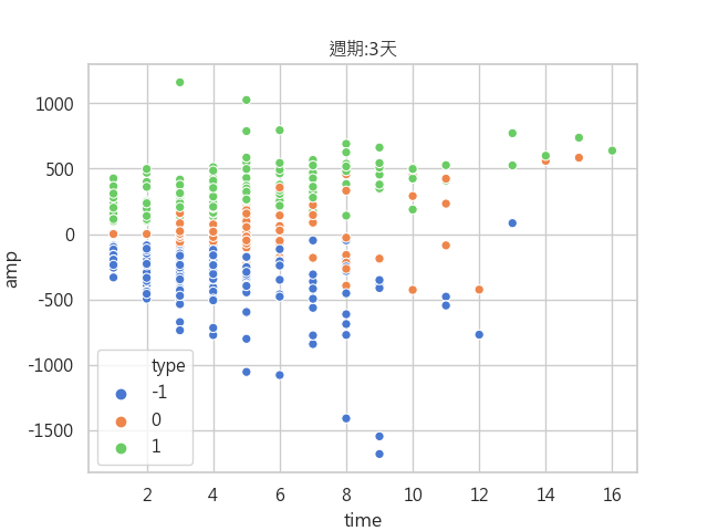
我們想先了解振福與持續時間的基本分布,因此把各個週期的散佈圖給畫出來。由下圖可以發現,一波上漲主要是集中在8天內,振福在500點左右。
def time_amp_scatter(f):
    df = pd.read_csv('data\high_low_' + str(f) + '.csv')
    df = df.astype(float)
    df.columns = ['pre_date', 'now_date', 'type', 'time', 'amp']
    df['type'] = df['type'].astype(int)
    print(df)
    sns.scatterplot(x='time', y='amp', hue='type', data=df, palette=sns.color_palette("muted", len(np.unique(df['type']))))
    plt.title('週期:' + str(f) + '天')
    plt.savefig('震幅與時間分布圖/' + '週期-' + str(f) + '天')
    plt.show()
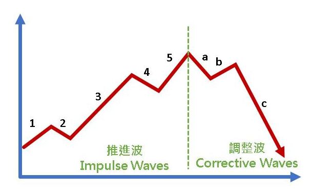
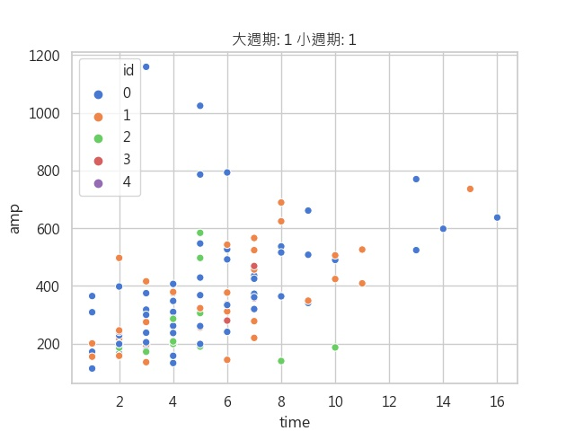
接著,下圖中,1~5波我們在大周期中定義為上漲,但我們想知道1、3、5波分別的漲勢與時間,也想知道2、4波分別的跌勢與時間。因此我們利用已知大周期為上漲的條件下,來細分小周期。
def big_small_compare(big_type, small_type):
    df = pd.read_csv('data\high_low_3.csv')
    df2 = pd.read_csv('data\high_low_10.csv')
    df = df.astype(float)
    df2 = df2.astype(float)
    df.columns = ['pre_date', 'now_date', 'type', 'time', 'amp']
    df2.columns = ['pre_date', 'now_date', 'type', 'time', 'amp']
    df = df[df['type'] == small_type]
    df2 = df2[df2['type'] == big_type]
    ans = pd.DataFrame()
    for index, row in df2.iterrows():
        tmp = df.loc[(df.pre_date >= row['pre_date']) & (df.now_date <= row['now_date'])]
        tmp = tmp.assign(id=pd.Series(list(range(0, len(tmp)))).values)
        print(tmp)
        ans = ans.append(tmp)
    name = '大週期: ' + str(big_type) + ' 小週期: ' + str(small_type)
    plt.title(name)
    ans['id'] = ans['id'].astype(int)
    sns.scatterplot(x='time', y='amp', hue='id', data=ans, palette=sns.color_palette("muted", len(np.unique(ans['id']))))
    plt.savefig('大週期10天小週期3天/' + name.replace(':', '-')+'.jpg')
    plt.show()
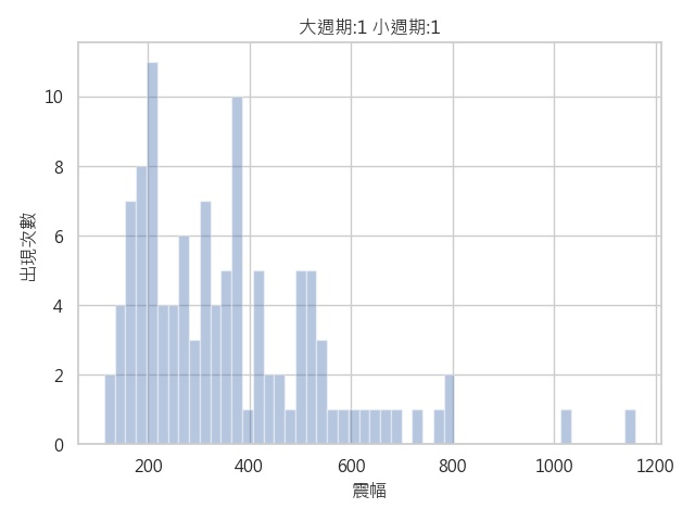
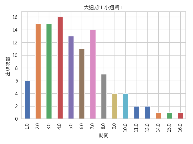
有了這些後,我們還是不太清楚哪些持續時間與震幅比較容易出現,因此我們就繪製了直方圖,來觀察各個周期容易出現的時間。
def big_small_times_amp_count(big_type, small_type):
    df = pd.read_csv('data\high_low_3.csv')
    df2 = pd.read_csv('data\high_low_10.csv')
    df = df.astype(float)
    df2 = df2.astype(float)
    df.columns = ['pre_date', 'now_date', 'type', 'time', 'amp']
    df2.columns = ['pre_date', 'now_date', 'type', 'time', 'amp']
    df = df[df['type'] == small_type]
    df2 = df2[df2['type'] == big_type]
    ans = pd.DataFrame()
    for index, row in df2.iterrows():
        tmp = df.loc[(df.pre_date >= row['pre_date']) & (df.now_date <= row['now_date'])]
        ans = ans.append(tmp)
    # print(ans[name].value_counts())
    ans['time'].value_counts().sort_index().plot(kind='bar')
    plt.xlabel('時間')
    plt.ylabel('出現次數')
    plt.title('大週期:' + str(big_type) + ' 小週期:' + str(small_type))
    plt.tight_layout()
    plt.savefig('震幅與時間次數圖/' + '大週期-' + str(big_type) + ' 小週期-' + str(small_type) + '時間.jpg')
    plt.show()
    sns.distplot(ans['amp'], kde=False, bins=50)
    plt.xlabel('震幅')
    plt.ylabel('出現次數')
    plt.title('大週期:' + str(big_type) + ' 小週期:' + str(small_type))
    plt.tight_layout()
    plt.savefig('震幅與時間次數圖/' + '大週期-' + str(big_type) + ' 小週期-' + str(small_type) + '震幅.jpg')
    plt.show()
所有的圖表與程式碼都在github上,若有需要參考可點下方連結。
https://github.com/wcchang1019/futures_time_amp_research